Logo Design 101: How To Craft A Professional Business Image
By admin-2
In today’s competitive market, a well-designed logo is not just a luxury; it’s a necessity. Your logo serves as the face of your company, playing a crucial role in brand recognition. It’s more than just an image; it holds the power to invoke emotions and associations among customers.
In this guide, we’ll walk you through every aspect you need to consider to create a professional logo.
-
Pre-Design Considerations
Table of Contents
Before diving into the design process, there are important steps to take. These preliminary considerations set the foundation for a logo that truly represents your business.
-
Define Your Target Audience
Knowing your audience is critical. You need to be aware of their age, interests, and behaviors. This understanding informs not only the design elements but also the platforms where your logo will be most visible.
-
Understand Your Brand’s Core Values
Your brand isn’t just products or services; it’s an experience you offer to consumers. What values does your business represent? Is it innovation, reliability, or perhaps sustainability? These core values should be reflected in your logo to ensure it resonates with your audience.
-
Research Competitors’ Logos
It’s important to survey the landscape of your industry. Look at the logos of businesses that share your market. Doing so allows you to identify what elements are effective and what doesn’t work. This research will help you carve out a unique space for your brand and prevent unintentional similarities.
By addressing these pre-design considerations, you’ll be better equipped to create a logo that is both aesthetically pleasing and strategically effective.
-
Color Psychology
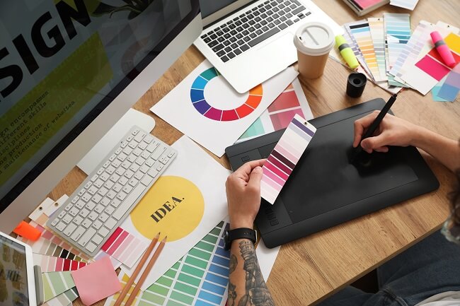
Colors have the power to influence perception, drive action, and even affect mood. When incorporated into your logo, they can evoke certain feelings and build a psychological link between your brand and your audience. Therefore, understanding color psychology is crucial in making informed design choices.
Let’s delve into the symbolism and psychology associated with common colors:
- Red: Known for its dynamism, red is a color that commands attention. It’s often associated with excitement, passion, and urgency. Businesses that want to convey a sense of action or attract immediate attention often use red.
- Blue: This color stands for calmness, trust, and reliability. It’s widely used in sectors like finance and healthcare, making it a popular choice for those using an AI logo generator tool to convey a sense of trustworthiness and stability.
- Green: Often linked with environmental themes, green also symbolizes growth and freshness. It’s suitable for brands that wish to convey a sense of harmony or renewal.
- Yellow: This color is synonymous with happiness and positivity. However, it’s a double-edged sword. Use it cautiously, as it can also signify caution or provoke anxiety if overused.
- Black: It’s a color often associated with luxury, sophistication, and seriousness, making it ideal for high-end brands.
- White: Representing purity and simplicity, white is often used to create a minimalist, clean look. It’s great for brands that want to convey straightforwardness and honesty.
- Purple: This combines the stability of blue and the energy of red. It’s often linked to creativity, luxury, and even spirituality.
- Orange: This color is known for its vitality and enthusiasm. It’s a less intense alternative to red but still packs a punch in terms of grabbing attention.
Given the powerful impact of color, selecting the right hues can be a game-changer in how your brand is perceived.
-
Types Of Logos
The right type of logo is crucial for your brand identity. By choosing a style that accurately represents your company and appeals to your target audience, you can communicate your brand message effectively and build a meaningful connection with your customers.
-
Wordmarks
Wordmarks consist solely of text, usually the company’s name or initials. Wordmarks work best for businesses that have a distinct and short name that is immediately recognizable.
-
Pictorial Marks
Pictorial marks are iconographic images that represent the brand. They are highly effective for brands that want to convey a particular message or value through an easily recognizable image.
-
Abstract Logos
Unlike pictorial marks, abstract logos don’t represent a recognizable image. Instead, they are geometric forms that embody your company’s values and identity. They work well for brands that want to convey complex ideas in a simple form.
-
Combination Marks
As the name suggests, combination marks integrate both text and symbols. It’s an excellent choice for brands that want the best of both worlds but require thoughtful integration of text and image to be effective.
By understanding the pros and cons of each logo type, you can better choose a style that effectively communicates your brand story.
-
Typography
Typography is an often underestimated element in logo design, yet it plays a vital role. After all, the fonts you select significantly impact your logo’s readability and resonance.
-
Serif Vs. Sans Serif Fonts
Serif fonts have small lines or strokes attached to the ends of letters. They are generally perceived as formal and traditional. On the other hand, Sans Serif fonts lack these strokes, offering a cleaner and more modern look.
If you aim for a classic, authoritative vibe, Serif might be suitable. For a more contemporary, minimalist brand, Sans Serif is often the better choice.
-
Font Sizing And Spacing Tips
Font size matters, not just for readability but also for impact. Larger fonts attract more attention, but use them judiciously to avoid overwhelming the design.
Spacing between letters, also known as kerning, is another critical factor in improving readability and aesthetic appeal. However, striking the right balance is key – too much space can make the text look disjointed, while too little can cause it to appear cramped.
Typography is not just an aesthetic choice; it’s a strategic one. Make wise decisions in font style to create a logo that truly resonates with your audience.
Conclusion
The impact of a well-executed logo extends far beyond mere aesthetics. It’s a powerful tool for building brand equity and establishing a lasting impression. With the actionable insights above, you can begin crafting a logo that will define your business for years to come.
